Thursday, 24 November 2016

pencil and paint


–The second of these is a depiction of a PlayStation 3 controller but with the inclusion of organs, bones and other innards replacing the right side. With ribs and lungs on the lower half and muscles at the top I used specific parts to fit the shape of the controller to make it appear that this is a view of the inside that would have been held in with the plastic shell as Petersen would. The medium that was used for these was solely watercoolers as they take less time to dry and are easier to handle than acrylics. I am highly considering using a piece like this for my final as it shows of bright colours and direct opposition with union.

–The third in the series created in the style of Mads Petersen this is where I began to branch off from just recreating this style of art instead I began adding different features. This time a smiling visage of a mouth was included in the large upper section of the controller, this was added to add a greater sense of emotion branching off to human nature and how we enjoy being immersed within a video game, also in the lower right the typical style of Petersen’s art has been included with the use of organs. The colours used were also a deviation from the original with the use of pencil and watercolour pencil to use the bright colours to bring out the monotone shades, and to great effect, this piece is among one of my favourites created this far as it combines juxtaposing features with both strong and muted shades and colours showing great variety united, and potentially worth considering as an idea for a final piece. 

–Taking another step away from person’s style of art using a seemingly mid-decomposition bird encircling a photo of an old, disused clock face. The bird has most of its muscles and hide exposed with all that is intact being the wings that are white with red tips, while the clock has yellowed with age and lost its hands so can no longer perform its function. Like the game cube controller water colour pencils were used, with the exception of that they were used to make the entirety of the bird. For the muscles, reds and blues were used while the hide consisted of creams and, browns and reds with the wings using a similar colour scheme. With the use of the clock and dead bird the representations within this composition are rather morbid, with death being the predominant, however technology and nature do both fit into this with the use of a creature with the clock. My personal favourite of the series created in the Mads Petersen style as it is a far more striking piece showing an actual organism rather than just a random assortment of organs. However the main issue is that the clock is a cut-out and the bird is a complex shape meaning that it is far harder to cut the image to fit to the drawing.    

–A piece similar to the bird within a clock this instead is a larger composition that occupies the entirety of the page, the main focus of which being toward the top of the page depicting a fox atop a clock, with leaves and cogs cascading and connecting toward the bottom of the page. The Fox is draped over the timepiece with skeletal face and paws that lead to muscle, ligaments and then fur. Also like the bird this image was coloured using water colour pencils and watercolours to give it striking colours of bright yellows, oranges and reds, as well as deep shadows. The clock on the other hand has a more pastel palette with yellows and browns and hands encrusted with red gems. Having stronger representations to death rather than technology and nature, however it does still fit within the theme with the use of autumn connotations as well as clocks being considered a marvel of old technology.


–A mostly experimental piece using pen and watercolours, this free-handed bird has a green painted circuit board style pattern that runs down its entire body but mostly around the face and wings. This was an attempt to combine technology and nature in a very literal sense, having less of a representation and more of an aesthetic appearance with unity as a greater theme than opposition. This piece is primarily experimental however I do believe that the style used can be developed into something that may be final piece worthy

–Expanding on from the style used to create the circuit board bird this time I have drawn the skull of a rat and completely coloured it green as well as used a pen to create a finer line making the traces more visible and to greater effect. The traces of the skull only partial cover the scull around the eye sockets and nasal cavity as any greater amounts would crowd the image with a greater than necessary amount of detail. Green is the chosen colour scheme of the skull as to me green is the colour that represents technology and nature the best and yellow was also used to break this trend and give impact to the composition as well as show some elements of semi natural colour. The primary mediums for this are watercolours and pen with the watercolours used to colour in the skull and the pen used to create the traces and to outline the image. I most certainly intend to use this style in the future as it represents how technology can be used to replace nature and often most go without even realising, showing the mimicry of technology, achieving what took millions of years of natural processes in a fraction of that time. However this itself is not suitable as a final mainly due to the lack of detail as essential it is a rat skull with traces therefore as part of a whole composition it may be worthy but as a single piece it is not.

–Essentially the same as the rat with the exception of that a different colour scheme is used with a different organism, in addition to this an additional element has been added, this being that there is also the pattern of a brain within the top section of the image. The main focuses within this piece is the tree, circuit board and the brain allowing this to not only appear like a tree but also like a brain attached to a spinal cord using pink and red this time as the main colour. Also like the rat watercolours and pens were used to colour this piece. However I am not satisfied with the final result of this image as it does not have the same impact and is also overcrowded with different elements, therefore I will avoid composing a piece in this manner and be more cautious using this style. 


A Drow is a fantasy race like Tieflings, drow of which are a subterranean sub-race of elves.  this portrait was drawn and shaded using pencil with light hair and darker skin, lower down in this drawing is a small pseudodragon being held. another less relevant of drawings and as a result it will certainly not be used in the future.

This focuses primarily on the unity of technology and nature through the use of prosthetics to replace natural parts lost such as limbs, however technology has not advanced enough to provide replacement limbs that even meet the complexity of the limbs animals were born with and as a result of that I had to create a sci-fi like image to show the point I was trying to convey. The image shows a shepherd like dog with mechanical prosthetics on its left side coloured using bright shades and metallic silvers white the dog is coloured in monotone black and white to keep the attention on the false limbs. In the future I most likely use aspects of this but in different mediums, such as stylised mechanics.
hands can often be a tricky subject in art causing many issues for many a student and artist, the first hand is an observational drawing of my own hand facing away from me while the second is a freehand drawing displaying the technique which I use to draw hands without the use of references. This display the construction techniques I use within my art and a display of observational drawing rather than a development toward my final piece.


digital art

 Dragonborn warlock
This character was drawn to fit my brothers D&D character Otu-Obara, for this I focused on using an Aztec style to give the sense of the worship of a forgotten deity.

Following various curves of movement pose the character and using a pallet of greens, brown and yellows with hints of red to signify a natural connection but also a noble one with a mix of complementary, spit complementary and harmonious.

Unfortunately, this illustration has not been shaded but I worry that may remove the bold and simple aspect I was hoping to achieve.


Dwarven barbarian
Like the illustration above this character is another D&D based design of the dwarven barbarian Drarrak in which he is meant to look outlanderish but also resemble a likeness to his player, who is far from such with bedded hair and round features.  

The colours used follow the backgroung using leathers and steel with veins of gold to showcase the dwarven greed.

Unlike the image above this one has been shaded and I do believe that it has improved the image overall however the time spent on shading the image does add significantly to the overall time spent.

Thursday, 13 October 2016

pen and ink


05/07/16
over the summer I decided to do some mixed observational and freehand drawing in which this time a cat was the main subject, the reference used for this was sourced from the internet and appropriate changes were made to make the feline look more simplistic and aesthetic, these freehand elements include the addition of the ribbons and bell, simplifying some of the fur detail so it looks softer and moving the tail into an s shaped upright pose as well as position the head so that it was looking directly at the viewer instead of off to the side. I am pleased with the results of this piece however I am still unsure as to weather or not I should colour it and with what medium.


15/09/16
drawn during my spare time on holiday this character was drawn completely freehand due to the lack of reliable internet connection. this piece is also a personal challenge as portraiture is what I find difficult with my speciality lying in animals and fantasy creatures (hence why this ended up as a trifling portrait), to further this challenge I decided to draw this character with curly hair. providing a good challenge i am mostly satisfied with how this turned out however it could have been better with some of the features looking off and numerous other mistakes.


14/09/16
using the style of Christopher Gasparian I have used pen to give an appearance of overlapping wire forming into two human figures within the drawn wire. using positive and negative space I have separated the figures in positive space to show forced separation ad being torn apart, perhaps from a loved one or oneself. I do not intend to add any colour to this piece as this will cancel the use of positive space, however I could include more pen to sharpen the gradient. also I would like to a some point in the future perhaps recreate this in wire as a small, three dimensional wire sculpture. this piece is based in the expressionism genre as it represents an emotion more than a physical being.


16/09/16
going off on more of a tangent within my theme I have created a portrait of a lion with wires pultruding from where the mane should be, this in most parts is a reflection of the art of Mads Petersen in the broadest of sense and represents how technology replaces to the suffering of wildlife and also how humans themselves sacrifice human nature to technology choosing that over socialising in extreme cases for long periods of time. I intend to use watercolours to paint this lion perhaps including the colour green as that is the colour of the circuit boards in which wires can be soldered onto. overall I am happy with how this image is coming along. however a diferent angle could have been used to give the lion a more realistic and 3D appearance. 


With a more comic like appearance using harsher lines and more weighted lines this drawing is of a figure with rapier in one hand and scales in the other, representing this figure as a vigilante of some kind, taking justice into their own hands. the scales reinforce this with a rose in the right and the skull and feathers of a bird in the other, this reinforces the roguish archetype, along with the crows. to create this, I used black pen to draw the initial outline and then add more to give weight to the lines, this piece is less relevant to my theme however does include some aspects of nature’s such as the symbolism created thought the use of crows and roses. As it is less relevant it is very unlikely this this piece will be considered for a final piece.


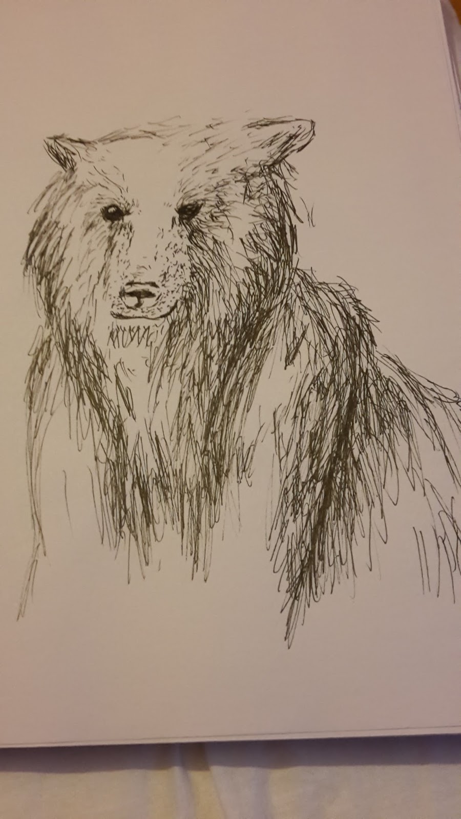
A simple rough sketch of a bear sat on its haunches drawn using black pen to draw loose lines to give a shaggy impression to the bear’s fur, the primary purpose of this composition was to use a different drawing technique that is far more sketchy as opposed to the typically more controlled means of drawing. Despite being a useful learning experience I do not intent to use this technique for future projects. this would be the closest to the art of Pollyanna Pickering however very loosely due to the nature of the image


depicting the skeleton of a common crow with the skeletal-muscular system of an arctic fox this anatomical drawing is composed to appear like a study of anatomy using dark brown pen with tea to give an aged appearance to this page, this uses a closer style to Pollyanna Pickering but also takes some inspiration from artists such as Leonardo da Vinci. This has or never was intended to be used as inspiration for a final but does allow for quick references to be made and as development toward the natural side of my art.

 a more stylised pair of images depicting a skill and the portrait of a deer. these were drawn using blue and green sharpie to create two lines to give a somewhat psychedelic style, the colours used are also harmonious showing the colours of nature. overall these two as interesting as a style it is its capabilities may be limited and as a result I most likely will not be using this in the future.  
 
 
 as birds and canids are becoming a larger part of my work I decided to expand upon this by creating a two-page study, one of crows and the other of foxes, unlike the previous sketches this one only focuses on the external features, with the crow focuses on the head, wings and talons and the fox on the jaws, paws and face. to ensure that the image can show a good level of detail and allow the image to stand out I have used black pen, this medium of which is my personal favourite to use because of the properties stated before. this piece can also be used as a reference point for future works that may be of different medium or dimension.

 
Most certainly not the most successful pieces drawn using the same principles for the drawn wire figures at the front of the sketchbook as this features a fox and a crow intertwined into a continual line drawing with the fox at the base of the tree and the crow atop a branch. Like the other wire mimic this one uses pen as a medium as it contrasts against the white paper and is draws a sharp line. Not the best pen was used in this composition and as a result I believe that dampened its quality thus bringing its quality down.

 
Using a technique that I learned a few months ago I created an ink splash effect but with several different colours of inks in which they blend together to create a composition, the autumn uses warmer harmonious colours such as reds, brown and yellows while the Aurora is a combination of every colour available. Created as an experiment for a background or component of another piece I created then by using a pipette to drip droplets of ink onto a sheet of paper and then used another sheet of paper/other paper like material to press the links between them, causing them to spread in all horizontal directions and merging with other colours, producing a pair of prints. The compositions created were very bright but also pleasant to look at, this made me less likely to consider them as background material due to how much they stand out, however the two autumn pieces had been drawn on as an experiment.

The paper print was outlined with black pen to look like a stylised leaf that covered the entire page, as a piece on its own this is rather weak and developing on it is most likely to be fruitless, as a result I left is as it is.

The second of the pair is on brown paper which appears a more suitable material considering the warmer colours used, in addition to this I drew a woodland scene within the print to encourage the viewer to take a second glance as the pen is only noticeable once the viewer approaches, however this may be an issue as there is a chance that the image will not be noticed therefore I have decided not to expand on this or consider it for future use.    

 
More of a whimsical drawing in my typical style using aspects of different creatures (namely canids and birds) to create a single entity and the use of technological aspects to link both of my themes together. the mediums used for this image was black and green pen, black to outline the skeleton and mechanical part and green to show the external outline of the creature. representing bot unity and conflict with the use of a mixture of natural elements and technology that affects it down to its very bones. this style focuses the most on what is portrayed typically by Mads Petersen by using what is inside as a greater focus point rather than what is on the outside. 


Tuesday, 20 September 2016

nature notes


The Herbert art gallery nature notes exhibition


This exhibition focuses on nature and how it changes throughout the seasons using mostly taxidermy and some paintings along with a sensory table for each season in the centre of the room. I attended this exhibition to hopefully to gain insight into natural forms and textures such as furs and feathers. The major factor in choosing to go to the exhibition is my theme of technology in which this exhibition focuses solely on nature therefore fits into part of my theme. All of the taxidermy used is form animals that died of natural causes.


Spring

Spring is the time of birth and nesting therefore the exhibition therefore the case representing spring was filled with taxidermy of young animals and nests of various types of birds. Each creature had a number and corresponding label. What can be observed from the spring table is that the furs of younger animals are far finer and also in many occasions darker in colour to match the earth below making it harder for predators to distinguish them while the learn of their surroundings. The sensory table consisted of a taxidermy rabbit and tubs containing artificial scents of the animals themselves and buttons that played sounds consisting of the calls of young animals and birds. The sensory table was interesting as visitors were actually allowed to touch the rabbit’s fur.


Summer

During the summer time the young of organisms are raised and taught 

To fend for themselves, summer is also the time in which rescores are most abundant as plants are able to photosynthesise more than in any other season, however the main risk of the hot summers is the risk of dehydration in both plants and animals. The case displaying summer consisted of mostly birds as this is when migrating birds visit England to take advantage of the abundance of recourses, thus greatly increasing the bird population, insects also take advantage of this and provide food for birds and featured in a smaller separate display case. Springs sensory table had a taxidermy mouse which could be stroked gently to feel the texture of the fur, while birdsongs and insect calls could be herd when one of the buttons on the table was pressed.


Autumn

This display was my favourite of the four showing a combination of mammals and food sources such as berries that animals gorge themselves on to prepare for the cold, fruitless winter. Within the main case was an adult fox, badger, rabbit and mole showing fully grown creatures allows for a comparison to be made with the first case, also the animals observed within the autumn case were bigger than I thought they would be, for example, the fox stood way above what I thought it would be, the badger also was taller than I expected. This case was useful because it allowed for the viewer to compare how animals have changed from spring to autumn form the colour of fur to the size of their bodies, giving the viewer a good representation of growth. The sensory table featured a taxidermy fox upon touch was surprisingly soft as I expected the fur to be far more coarse, while the sounds were of a fox, badger and other shown animal calls.


Winter

Like summer the winter case also consisted of mostly birds as more iconic winter birds such as robins become more visible as many birds leave to warmer climates, also there are many types of flora and berries that provide as a food source for wildlife. The sensory table in the winter display included a crow and other various animal sounds and scents, the crows feathers were soft to touch also the bird was larger than expected also the details of the feathers were more visible as it is almost impossible to be that close to a crow in the wild.


Summary

As this exhibition consisted of mostly taxidermy it could not be used to examine art techniques, however this exhibition has been useful to observe and document natural form as the textures of feathers and furs can be seen and also the colours are also visible allowing for a close up view of wildlife. The paintings within this exhibition mostly consists of watercolour studies of plants, this is not entirely useful in terms of techniques however some of the other paintings do use some interesting techniques such as printmaking and oil paintings to depict natural forms. Overall this exhibition was useful to allow me to study natural forms and how colours and forms change throughout the seasons. The sensory aspects of the exhibition were very interesting however my main criticism for these is that I was not able to perceive the scents that were contained in boxes very well and found it hard to distinguish them from each other though other people did not seen to have this issue, therefore I have not included them in the season paragraphs, despite that I did find the sensory tables quite useful as it has allowed me to further my knowledge of the sounds of various animals and of the textures of their fur and feathers.

nature notes


The Herbert art gallery nature notes exhibition


This exhibition focuses on nature and how it changes throughout the seasons using mostly taxidermy and some paintings along with a sensory table for each season in the centre of the room. I attended this exhibition to hopefully to gain insight into natural forms and textures such as furs and feathers. The major factor in choosing to go to the exhibition is my theme of technology in which this exhibition focuses solely on nature therefore fits into part of my theme. All of the taxidermy used is form animals that died of natural causes.


Spring

Spring is the time of birth and nesting therefore the exhibition therefore the case representing spring was filled with taxidermy of young animals and nests of various types of birds. Each creature had a number and corresponding label. What can be observed from the spring table is that the furs of younger animals are far finer and also in many occasions darker in colour to match the earth below making it harder for predators to distinguish them while the learn of their surroundings. The sensory table consisted of a taxidermy rabbit and tubs containing artificial scents of the animals themselves and buttons that played sounds consisting of the calls of young animals and birds. The sensory table was interesting as visitors were actually allowed to touch the rabbit’s fur.


Summer

During the summer time the young of organisms are raised and taught 

To fend for themselves, summer is also the time in which rescores are most abundant as plants are able to photosynthesise more than in any other season, however the main risk of the hot summers is the risk of dehydration in both plants and animals. The case displaying summer consisted of mostly birds as this is when migrating birds visit England to take advantage of the abundance of recourses, thus greatly increasing the bird population, insects also take advantage of this and provide food for birds and featured in a smaller separate display case. Springs sensory table had a taxidermy mouse which could be stroked gently to feel the texture of the fur, while birdsongs and insect calls could be herd when one of the buttons on the table was pressed.


Autumn

This display was my favourite of the four showing a combination of mammals and food sources such as berries that animals gorge themselves on to prepare for the cold, fruitless winter. Within the main case was an adult fox, badger, rabbit and mole showing fully grown creatures allows for a comparison to be made with the first case, also the animals observed within the autumn case were bigger than I thought they would be, for example, the fox stood way above what I thought it would be, the badger also was taller than I expected. This case was useful because it allowed for the viewer to compare how animals have changed from spring to autumn form the colour of fur to the size of their bodies, giving the viewer a good representation of growth. The sensory table featured a taxidermy fox upon touch was surprisingly soft as I expected the fur to be far more coarse, while the sounds were of a fox, badger and other shown animal calls.


Winter

Like summer the winter case also consisted of mostly birds as more iconic winter birds such as robins become more visible as many birds leave to warmer climates, also there are many types of flora and berries that provide as a food source for wildlife. The sensory table in the winter display included a crow and other various animal sounds and scents, the crows feathers were soft to touch also the bird was larger than expected also the details of the feathers were more visible as it is almost impossible to be that close to a crow in the wild.


Summary

As this exhibition consisted of mostly taxidermy it could not be used to examine art techniques, however this exhibition has been useful to observe and document natural form as the textures of feathers and furs can be seen and also the colours are also visible allowing for a close up view of wildlife. The paintings within this exhibition mostly consists of watercolour studies of plants, this is not entirely useful in terms of techniques however some of the other paintings do use some interesting techniques such as printmaking and oil paintings to depict natural forms. Overall this exhibition was useful to allow me to study natural forms and how colours and forms change throughout the seasons. The sensory aspects of the exhibition were very interesting however my main criticism for these is that I was not able to perceive the scents that were contained in boxes very well and found it hard to distinguish them from each other though other people did not seen to have this issue, therefore I have not included them in the season paragraphs, despite that I did find the sensory tables quite useful as it has allowed me to further my knowledge of the sounds of various animals and of the textures of their fur and feathers.

brick wonders


Brick wonders

This exhibition consisted of sculptures made solely made of Lego bricks, these sculptures all range from about 30cm to about a metre with most of the sculptures featuring natural environments and geographic monuments such as pyramids, Chinese pagodas and temples all made entirely of Lego. Held in the Herbert art gallery this exhibition also consisted of two dimensional pieces that are constructed to look almost like 8-bit paintings on a very large scale. All of the pieces are made by several artists who combined all of the monumental pieces into a stop motion animation which follows a photographer as he travels through various monuments.


Notable pieces

All the monuments within this exhibition are worth mentioning as notable pieces as they are the larger and more detailed of the pieces. These include:

London bridge

This features the first bridge built to span the river Thames at its peak in which it was incredibly busy as there were no other means of crossing without the aid of a boat in addition to the residential homes that were also visible on the bridge. This sculpture shows the bridge in all its glory highlighting the bustling city very well.

Great pyramid of Giza

Showing the pyramid still under construction this large display highlights the epic scale of the build to create the giant pyramid and also the harsh and arid working conditions that the workers had to endure while the pharaoh remained safety within the shade.

African savanna

Showing a high density of wildlife in comparison to the amount of space in which they are spread this showcases the diversity of plant and wildlife within the African savanna, most of this display feature more of an arrangement of Lego foliage than a display of structure. Spanning about just under a metre this display is not one of my favourites.


in addition to the monuments there were other sculptures featuring other natural and manmade phenomenon such as the hoover dam and Niagara Falls that were not included within the monuments section as they were of much smaller scale, however the largest display featuring an airport was very impressive as it was indeed very large and also very detailed taking up at least two metres in the smallest dimension.

Favourite

 London bridge

My preferred piece is a replica of London bridge as it most appeals to my personal taste of historical British architecture. This piece depicts London bridge at its busiest showing just how crampt the space was as it was heavily built upon leaving only about twelve feet of walking space from the two story buildings on either side in addition to many small boats traversing the river Thames below. I love how concentrated this piece is how it focuses the bustling streets into a smaller space, also the use of woody colours and greys to show the structural differences and variation in single colours to show textures such as brickwork.

Least liked

The smaller pieces were less impressive as they were only around 30cm and consisted of rooms such as a surgical operating room in addition to a syringe and a pill, they were the simplest of the pieces the surgery however did achieve its goal of appearing as though it could have come out of a drama by depicting a surgery in progress from a bird’s eye angle with a surgeon and figure watching from the outside but lacks the intended intensity as it is made of Lego. The issue stated is the only real issue with the piece other than that it is just as impressive as the rest of the sculptures.


artists


artists


the chosen artists all represent different aspects of my theme of technology and nature, showing them separately and together. the most prominent theme within this document will be nature as this is a more common theme within art, and as a result it will be most likely that nature will also be more prominent within my art, however I will aim to include a greater quantity of technology. because technology and nature are often viewed as opponents and in contrast I aim to present them in a more unitive way.


Christopher Gasparian still alive


using the human from to create sculptures made of wire and sometimes including mud rock to add greater detail, the sculptures often feature either a full body or a bust in which the wire is used to create a basic frame that is then coated in more wire wrapped horizontally and jaggedly around the frame to create the full sculpture complete in a human form, around many of the sculptures is additional wire that encases some of the sculptures for example in one piece the additional wire is used to entrap the figure in a matted net that surrounds the figure randomly. the metals are dark and placed somewhat randomly giving them a far more intimating presence. Most of these sculptures seem to have some representation to an element of entrapment as materials like wire of often used to bind create enclosures, while the darkness of the metal hints toward more negative emotions, also the poses of the sculptures also reinforce this as they are not what most would consider a natural pose that does appear to be uncomfortable.

Judging from the tittle of the title and the art itself this hints toward perseverance within human nature and using the drive to survive to endure through a dire situation with the entanglement of wire representing both physical and emotional trauma in which can be overcome through perseverance.

In relation to my theme of technology and nature this is the most loosely connected as this refers to a more physiological element of nature in which focuses primarily on how a person may be/feel trapped and how we all try to survive and despite all we are still alive.


In my opinion this style of art is very close to my preferred style of sculpture using wire and mud rock to from partially realistic forms making them an interesting subject that draws the eye, also the strong representations within each piece makes them worth a lot more to me.


mads Petersen the anatomy of tech


By combining biological elements with electronic devises the artist has depicted them as similar to nature as they run like organ systems and are able to carry out a function or multiple function like the organ systems in our own bodies, also by putting them together in a way that continues the design of the electronic device he has juxtaposed then using a verity of hot and cold colours like pinks and blues alongside the dull greys and polished blacks making the two elements stand out astoundingly well showing the difference between the two. The strong juxtaposition is incredibly effective as the two elements he uses are very different but also ironically similar as they both carry out functions but in ways that are both similar and different combining technology and nature in function.
The style that this artist uses is realistic but brighter and more simplistic using digital mediums to create his art, for example the controller lacks detailed texture but the basic textures are visible also the colours are more outstanding like the teeth and connecting tissues have stronger shades of red and blue making the entire piece more vibrant. The transition between device and organ/organ system is abrupt like in a biological diagram in which layers of an organism is shown from an angle that gives the best view, also buttons and other such receptors are left in place but shown connected to nerves or tissues that connect them to the device but as part of it like an eye in a camera.

The style of his art is very bold and stands out against the white backgrounds using bright colours in a simplistic style to draw the eye of the viewer to compare the dull and bright colour palettes which is a style that works best when using digital mediums. Also because of the digital nature of his art the actual subjects are far more relevant and eye catching.

His art connects to both elements of nature and technology using organs and other innards to represent technology as organisms highlights the similarities of various gadgets and living creatures in a juxtaposing way, also by presenting them in a way similar to a biology diagram enforces this highlighting the organisation of the biological components within the devices, also by using a white background he supports the appearance as an unlabelled diagram while drawing attention to the central image.

This style of art is my favourite of the three, as much as I love sculpture, this style represents how I portrayed nature and technology almost perfectly. Also the use of digital medium is preferred by myself as I do enjoy using software such as Photoshop and such alike that. Also this the most relevant in literal terms as it.


Andy Goldsworthy


unlike the two preceding artists Andy Goldsworthy uses shapes such as spirals and other abstract shapes to give an aesthetic appeal to all of his pieces that can reflect emotions or the very essence of nature itself, the materials that he uses in his art are almost always natural with his most famous pieces being made from leaves and ice in which he places the leaves in a chromatically order with the darkest on the outside and fading into the lighter shades before using a solid black centre to break the harmonious colours, the ice star on the other hand is made by fusing various icicles to a central point having all the edges jutting out by heating the bases and refreezing them to create a delicate but sharp sculpture. Using the leaves, a lot of his sculptures have somewhat of a psychedelic appearance using natural forms and making them appear unnatural while the ice is delicate but appears like an effective weapon, from this it is apparent that each piece has a different meaning and connotation attached to it, however they do all strongly connect to their season for example the ice like winter is sharp and cold but often short-lived and fragile.

Andy Goldsworthy’s art mostly relates to the natural side of my theme and also the elements of sculpture that I intend to use. His art is a great inspiration for colour and creative use of natural material to give an appealing aesthetic, however this does not connect to any aspect of the technological side to my theme.   

Through the years Andy Goldsworthy has been mentioned and taken inspiration from on many occasions during my fortnightly art activities during the years I was home educated however I had never had the chance to use his art as inspiration for any larger projects.   


Pollyanna Pickering   

The poppy field
Published to commemorate Pollyanna's 2012 exhibition of work at the National Memorial Aboretum this painting features Pollyanna’s favourite barn owl, Angel amidst a field of poppies. This painting depicts British wildlife using a photorealistic style, to achieve this level of detail Pollyanna uses gauche paints which are similar to oil paints but also to acrylics, allowing for far richer colours than acrylics but taking less time to dry than oil.

This painting in particular was chosen not only because it is an increasable depiction of nature with beautiful levels of detail but because it represents Pollyanna as an artist with her close connection and love of birds of prey and the British countryside as well as being personal to her showing one of her owls. 

Overview

Spending the 15 years of her career tending to her licenced wildlife sanctuary in the peek district in Derbyshire which specialised in birds of prey, however locals would often also bring various woodland animals such as foxes or even badgers, and as a result the had to care for more than just raptors. Most of the animals brought in to the wildlife centre were orphans that were raised and rehabilitated on site with those that could not be released in the wild spending the rest of their natural years in the sanctuary. Over the years hundreds of birds and mammals were raised, Cared for, and rehabilitated by Pollyanna Pickering. However as her artistic career expanded she decided to downsize due to spending more and more time away. To compensate for this she set up the Pollyanna Pickering foundation to help aid wildlife even if she wasn’t there in person.


All of her paintings feature photorealistic wildlife scenes such as landscapes and mostly using mammals and birds as the centrepiece to each of them to create a stunning beautiful extract of nature, in addition to this all of the creatures that she paints have been witnessed by her in their natural environment refusing to paint anything she hasn’t seen with her own eyes adding a very personal aspect to her art making it more desirable with each piece being connected to a different trip or inspiration.


The Patchins art festival is where I met Pollyanna personally in which we discussed her art as well as more casual topics before asking Pollyanna to fill in a short questionnaire which can be found in the evidence folder. I love her art as because of